
When any kind of data has to be analysed, a Power BI developer will often build meaningful reports and dashboards to display the data, enabling them to interpret the various scenarios for consideration. Power BI will generate these visual reports using already built scenarios however, many users may wish to customise their reports to better suit their data analysis requirements.
In this article I will explain how to enable the self-service option and demonstrate with an example how you can use it in a more appropriate way.
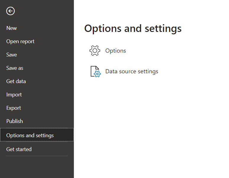
Want to give a user the best self-service experience and don't know how? There are some simple tricks in Power BI Desktop that enable users to customise reports as they wish.
3. Options -> Current File -> Report settings
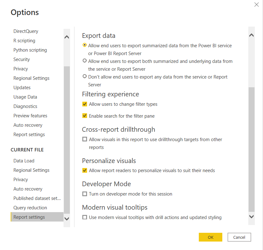
4. Look for Personalize visuals and check if the option is enabled or not.
5. If it's disabled, simply enabling this will solve the problem.

6. Click 'Ok' and go back to the report
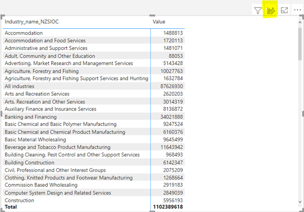
If we observe, a personalise visual option appears in the top right-hand corner of the screen.
Once the icon appears, publish the report to Power BI Service and share it with the user who wants to customise the report in their own way.
This icon allows user to customize any visual, by replacing the fields etc.,
Once you’ve adjusted your report settings and a matrix visual and Personalization option is enabled to Power BI as demonstrated above, you can now follow the example below:
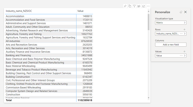
2. After publishing, click on the same personalize visual icon on the top and the Personalize box appears.
3. Now the user can see the same results by selecting any visual he wants or by adding few more fields to understand the results better.
4. For example, a user would like to see the above results in the bar chart.
5. Let's see how to choose the bar chart visual from Personalize box
a) Visualisation type - > Clustered bar chart option
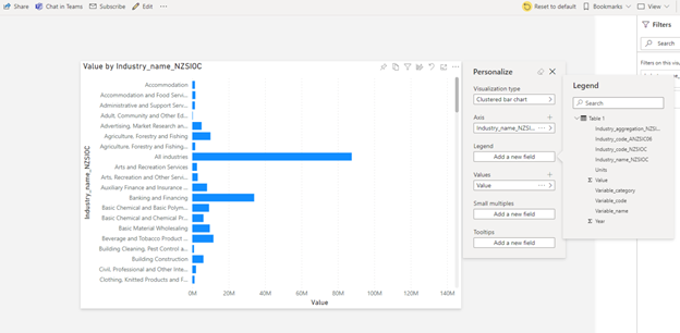
b) Turn the legend on for a more detailed view
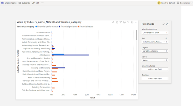
Note: If this page is refreshed, the view will revert to the original page with the Matrix again. Make sure you save your report to use again next time.
c) Save and bookmark your report for later.
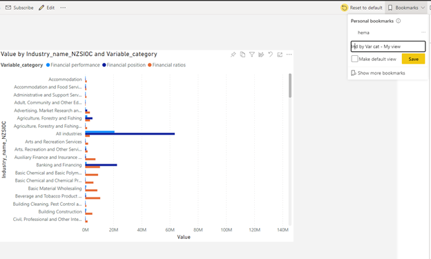
d) Click on reset to default - this will revert back the initial report the way it was published.
e) Bring your dashboard back - go to bookmarks, check your saved bookmark and this will display your personalised view of the analysis.
By following these steps a user can create their own view, while not affecting the original report.
A simple process, yet an important one to know. I hope this helps with your reporting.
Related Reading: Business Intelligence
Copyright © Tridant Pty Ltd.