
Microsoft Power BI is a powerful business intelligence (BI) tool that is continuing to gain market share and adoption for its affordability and ease of use. In the past few years it has consistently made the top of the best BI tools lists, and for good reason.
With many pre-built templates available to use, Power BI dashboard design is smoother than ever. However, without a style guide to use as reference, it can be challenging to make full use of Power BI’s customisation capability and create dashboards that work in harmony with your brand’s visual identity and user needs.
In this video, Sonja Meyer, Design Anthropologist, explains the benefits of using Style Guides within Power BI and demonstrates how to set one up for your reporting. Sonja provides an in-depth analysis of the three key pillars that create an effective Style Guide to help you optimise your Power BI usage and assist with your data-driven decision-making.

In the article below, we discuss why it’s important to create a style guide for Power BI implementation and what this could look like.
Brand application is just as important in internal documentation as it is in external marketing and promotional collateral, and yet this often gets overlooked. While your customers will likely never see your reports, unless you are taking the exciting next step towards external data sharing, staff and other end users will connect more powerfully to dashboards that have been designed to suit your brand’s visual language and style.
Seeing branding applied in this way evokes trust, recognition, memorability and an overall better user experience that helps businesses make good decisions.
When a new data visualisation consultant or developer joins the team, a style guide will make it much easier for them to pick up where another person left off.
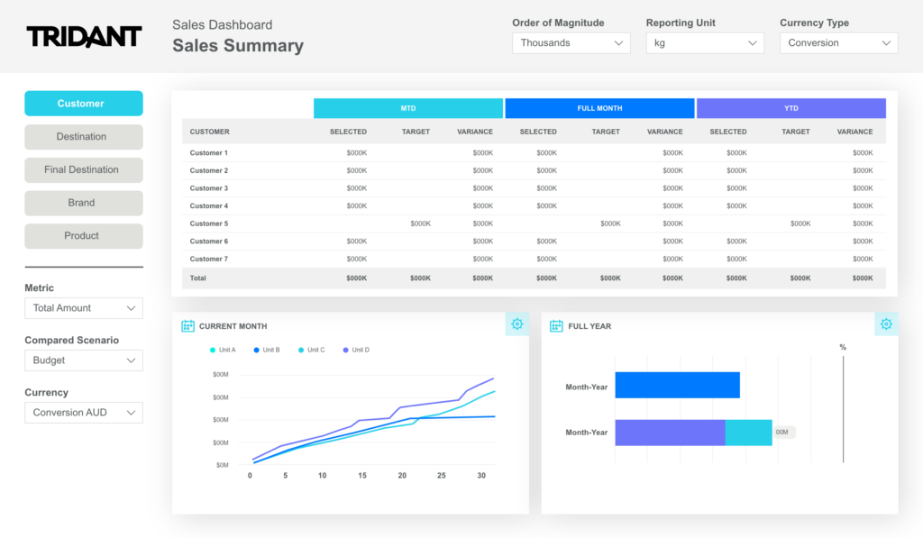
You can create your own custom layout template in Power BI that can be used as a starting point for new dashboards. You should save a template for each of the layouts you show in Section 1 below.
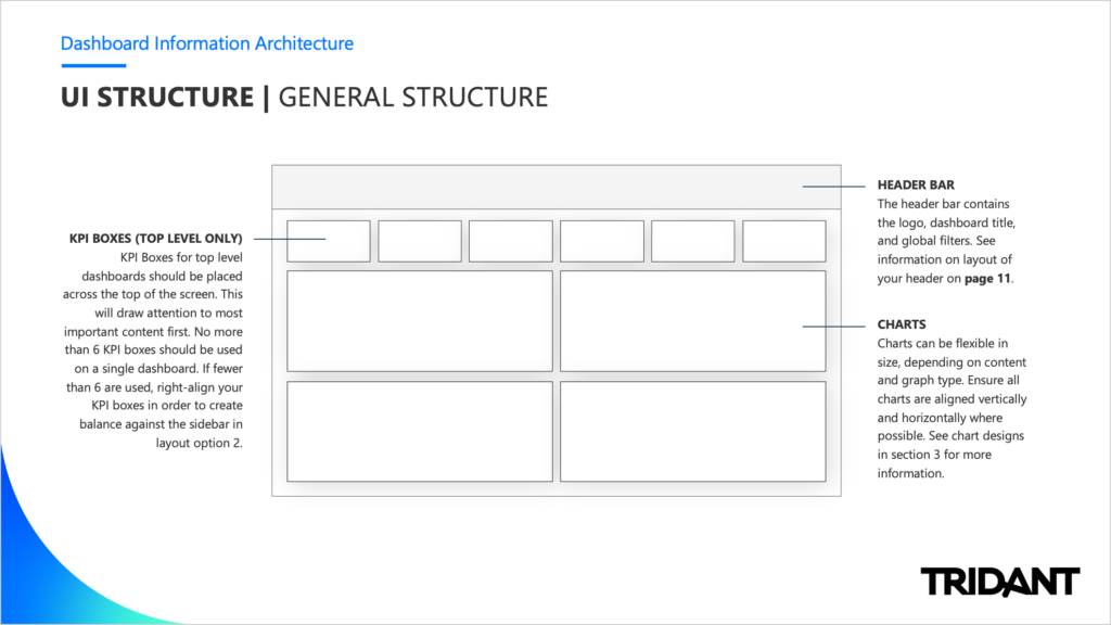
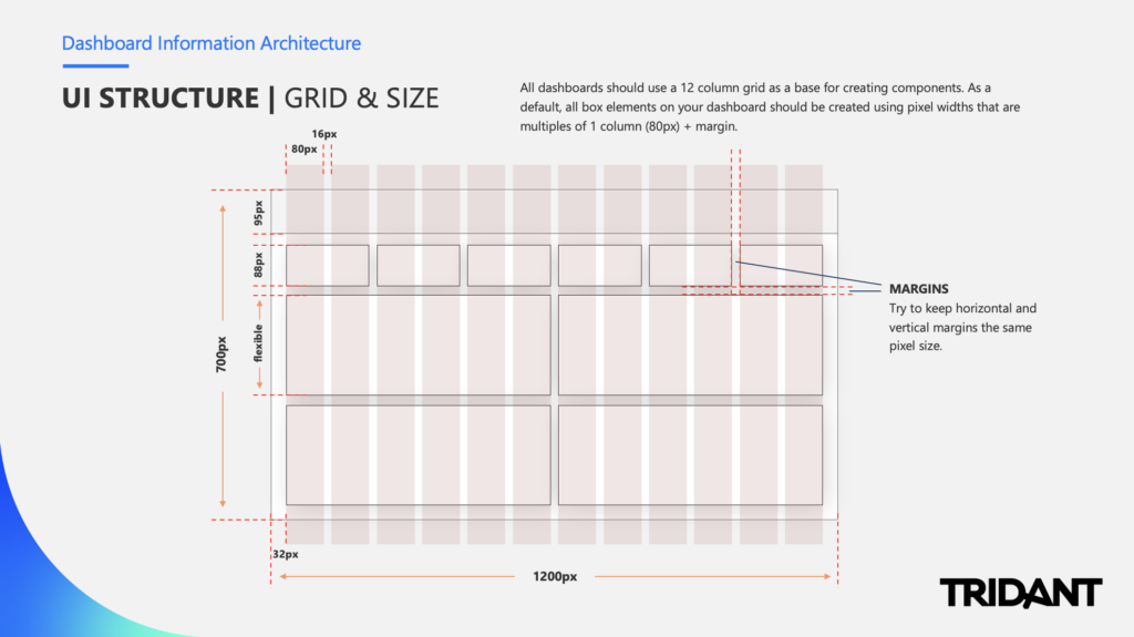
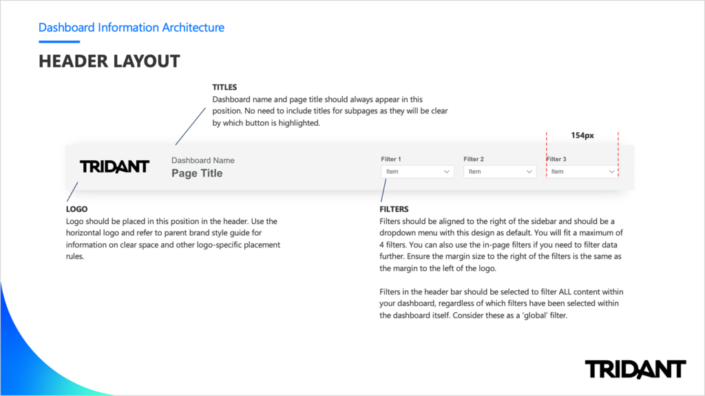
This section should provide an overview of the dashboard interface. You may wish to include items such as:
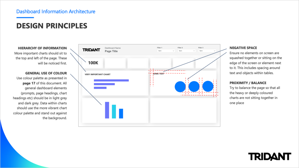
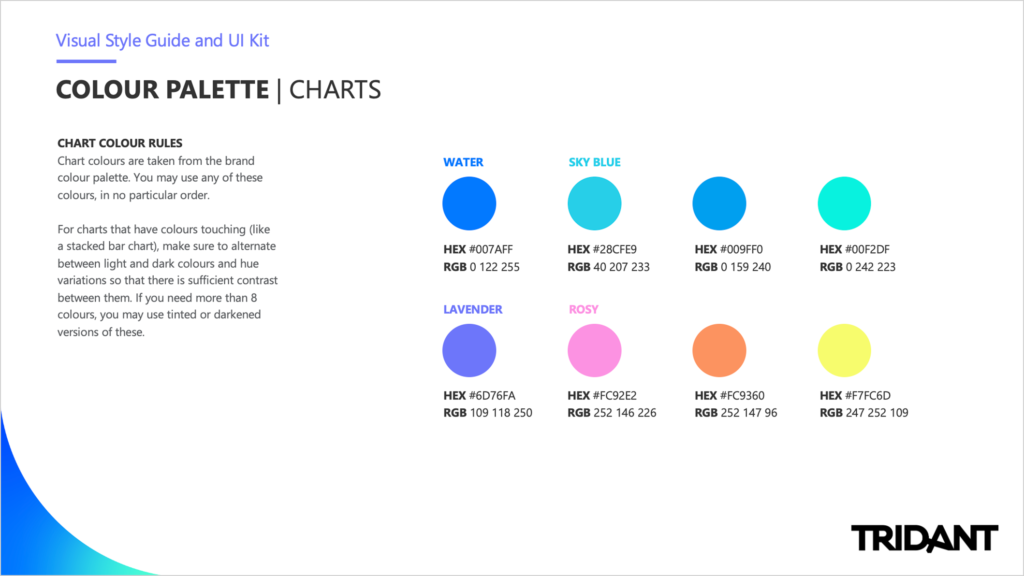
This section can be used to explore more detailed styling and best practice rules for putting together a dashboard, report or scorecard. This section can also act as an asset kit or UI kit in that the elements presented - such as fonts and icons - can be linked to and accessed as packaged files. In this section you might like to include:
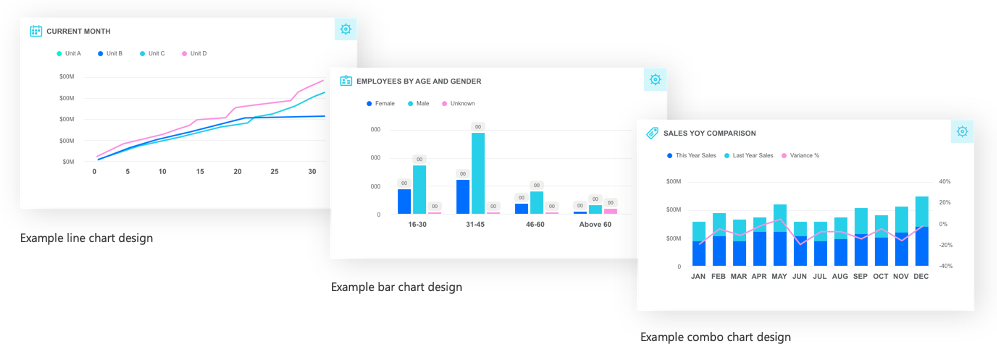
This section can be dedicated to providing example designs or mock ups of individual chart designs. Power BI allows a good amount of chart customisation, so it's important to spend some time creating rules around specific visualisation types. This may include:
You may decide to include some information and screenshots on how to use Power BI for those less advanced users. This could include:
It’s important to consider individual skillsets of BI developers. Having options in your style guide for both entry-level and more advanced users is a great addition. This might include template examples for a ‘basic’ skinned report vs a more visual or interactive dashboard.
Depending on which Power BI product you’re using, you have a couple of options for sharing dashboards and libraries. Be sure to understand what you’re working with before including complex visuals and images as these will need to be either embedded or hosted somewhere with open permissions in order to be visible to all users.
While you can import external font files in Power BI, we recommend using a Microsoft font (that comes with the software) where possible. This ensures all users will be able to see the fonts correctly as these will be installed directly on their machine.
Power BI is quickly becoming the de facto standard Enterprise Business Intelligence tool, however many organisations are allowing it proliferate unguided throughout the organisation without adequate thought towards good design principles and practices. The result is a substandard implementation and dissatisfied users requiring effort to undo that technical debt. Collaborating with a visual designer or data visualisation expert on the development of a professional style guide will be both powerful and invaluable when it comes to your organisation’s Power BI dashboard design and data visualisation projects.
Please contact us if you would like to have a discussion with us about how Power BI can add value to your organisation.
Sonja Meyer is a Senior Visual Designer and Co-Director of Ethical Design Co. Sonja has been working with Tridant as a design consultant for 11 years, providing customers with bespoke design solutions that enhance visualisation capability.
Copyright © Tridant Pty Ltd.