
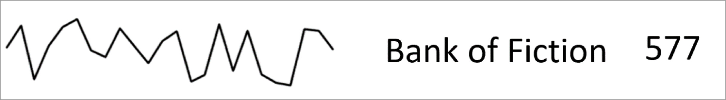
When you think about it, one of the most common data representations is a word followed by a number. For example, a heading in a document with a section number, a map with overlays of places and mountain heights, or the share price of your latest investment:

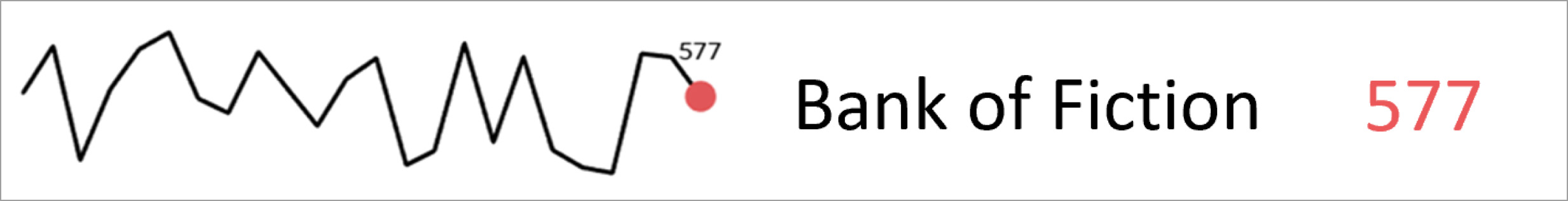
Without context however, a number is just a number. Once compared with historical measures, the number gains more meaning:
Still lacking is a scale to help qualify what could come across as a floating number. A nice tie-in to the most recent data point, with the actual number, is to use a colour accent:
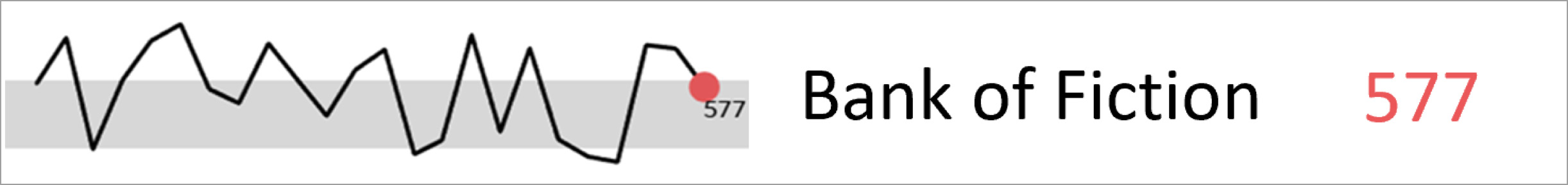
 Further context can then be provided in the form of a range (or average) to better highlight what is normal, or not. Data points above or below the range may be points of interest or possible outliers requiring further investigation:
 Multiplying this format into one of my other favourite statistical visual representations, small multiples, allows the reader to quickly assess deviations across many variables and measurements for fast comparison:
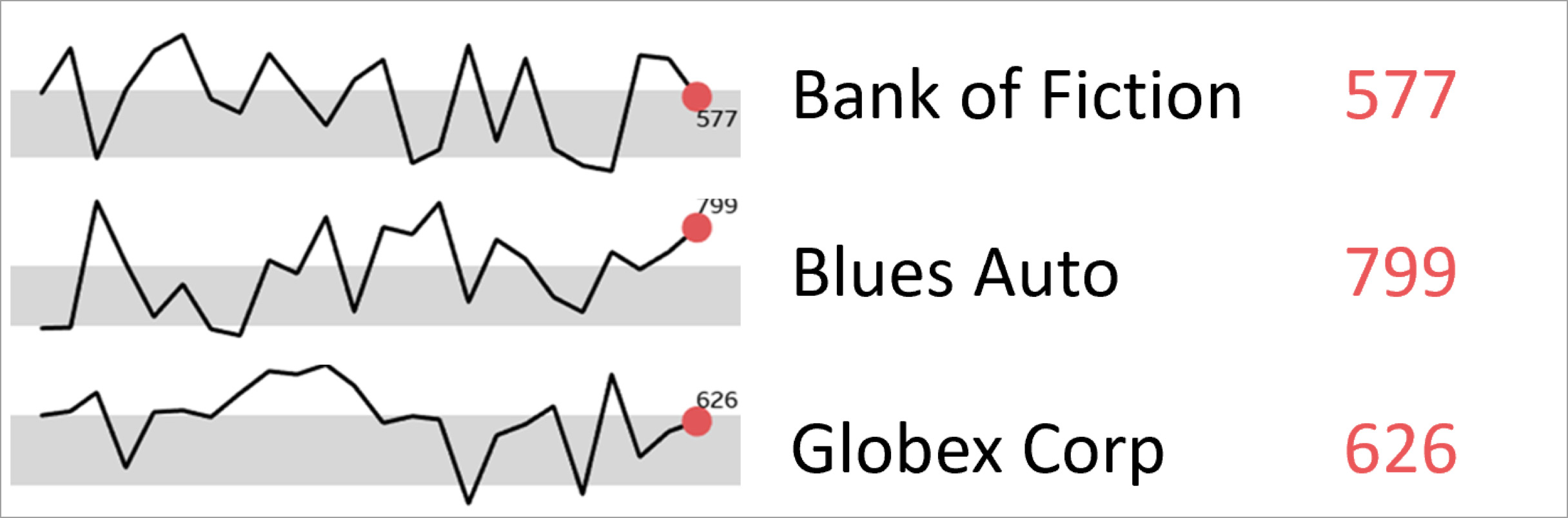 Sparklines greatly increase the amount of data we can ingest at any one time, allowing us to reason and make comparative distinctions quickly. It takes the reader’s eye away from the precise detail of numbers and pushes focus to the trends and variances – which is often where the bigger insights can be found when consuming large amounts of data.
Sparklines epitomise the statement by my data hero Edward R. Tufte, data visualisation pioneer and author of The Visual Display of Quantitative Information, that it is better to be approximately right rather than exactly wrong.
Unpack your enterprise challenges with bigger insights.
Copyright © Tridant Pty Ltd.