
Effective reporting offers meaningful business data and valuable insights, best delivered in the form of visually-appealing reports. Of course, some users who access these reports are likely to be living with a visual or physical disability, or cognitive impairment. It’s therefore vital that reports are generated with the accessibility requirements of every user in mind.
Reports with various accessibility features in-built will help ensure users with disabilities are able to easily and successfully interpret information for their own purposes.
Microsoft's Power BI - a leading business analytics and data visualisation platform offered by Microsoft - enables exactly that! Designed to help users create and view interactive reports and business intelligence, it boasts a straightforward interface that allows every user to view reports in a way that best works for them, thanks to advanced accessibility features.
In this article, you’ll discover some of the useful accessibility features that can be incorporated into reports generated through Power BI.
Power BI includes a number of built-in, default accessibility features, meaning no action is required from the user to enable them. These features include:
Some users rely entirely on the keyboard in order to access or navigate reports. Power BI offers incredible levels of keyboard user-friendliness, with visual interaction, page navigation, and Data Analysis Expressions (DAX) editor capabilities all accessible through the keyboard alone.
Helpful examples include …
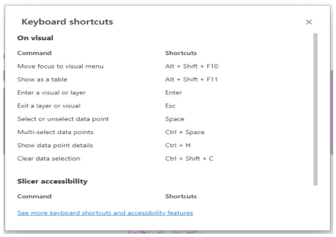
After entering the Power BI interface, simply click ‘Shift + ?’, and a pop-up dialogue box will appear, including a list of frequently used keyboard shortcuts, as well as a link to a full shortcut list, as seen in the image below:
By pressing ‘CTRL + F6’, users can move between the various sections of a report.
Once in the required section, the up, down and side arrow keys can be used to navigate through. For instance, in the report canvas section below, these keys can be used to take you to the tabs in the top left and right corners, as well as the three tabs in the centre.
Figure 1 - Report canvas section
The first page tab will be selected if we press them again (Fig 2). In Power BI Server, filters in the upper right corner will be selected after the top left image if we press then twice (Fig 3).
Figure 2 - Page navigation section
Figure 3 - Filters pane section
By navigating to a particular visual or panel in a report (for instance Navigate, Filter or Data Refresh in Figure 1), and then pressing ‘ALT + SHIFT + F11’, the relevant information will appear below the visual in question.
To further increase accessibility, Power BI contains in-built screen-reader functionality. After navigating to visual areas on the screen using the keyboard shortcuts outlined above, the title and type of that visual, as well as any alt text associated with it, will be read-out.
For the uninitiated, alt text is, according to HubSpot, “the written copy that appears in place of an image on a webpage if the image fails to load on a user's screen. This text helps screen-reading tools describe images to visually impaired readers.”
High contrast mode uses a limited colour palette on-screen, with contrasting colours for a more user-friendly interface. Traditionally, in order to enable high contrast mode the associated setting must be selected via Windows. This can be achieved by searching ‘Find a setting’, clicking on ‘High contrast’, and selecting from one of the four available options:
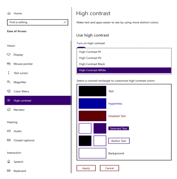
When viewing content in Power BI, the high contrast mode selected via Windows will then automatically take effect.
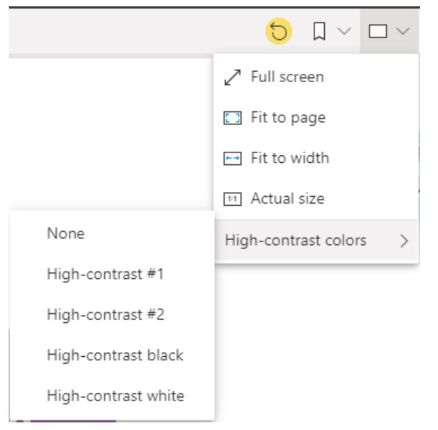
However, what users might not realise is that Power BI actually contains its own option for high contrast viewing. As a result, rather than altering the settings of the entire desktop via Windows, high contrast can be enabled exclusively for Power BI. Simply click on the small rectangle icon in the upper right corner of the interface, before selecting ‘High-contrast colors’, and one of the four associated options (depending on your browser type):
As demonstrated in the image below, if a visual appears cluttered and provides a large amount of information, it may be possible to focus on a single element of that particular visual. Clicking the ‘Focus mode’ button in the top right corner of the screen will switch the view so the element you want to focus on is displayed in a whole-of-screen format. The result? A cleaner and less cluttered visual user experience, with reduced opportunity for confusion!

Power BI also includes various custom accessibility features, which require the user to take steps to ensure they are configured. These features include:
As mentioned above, alt text is used to describe the visual content on a website for use by screen-readers. This type of content plays a vital role in boosting accessibility for visually-impaired users, particularly when you consider that an image title alone can only provide very high-level information.
As seen in the image below, to add alt text in Power Bi simply select the visual you want to apply it to, then select the format brush icon, followed by ‘General’, before scrolling down and selecting the ‘Alt text’ box. It is here that you can enter your detailed written information.
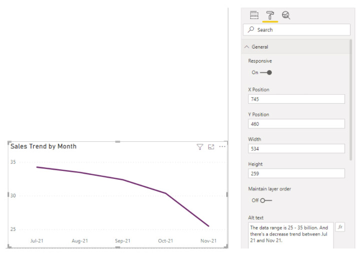
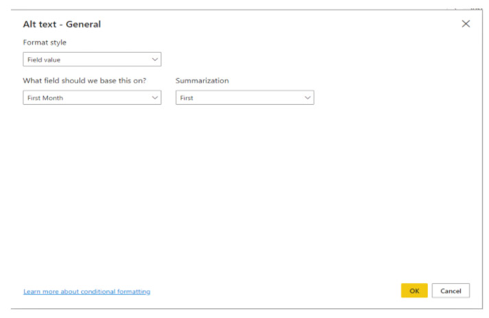
To apply any conditional formatting that will guide how the screen-reader will announce your alt text - such as the value of the first or last month - you will need to add some additional configuration. Click on the ‘fx’ button beside the ‘Alt text’ box, and a pop-up window will appear, as seen in the image below. Use this window to add configurations that will ensure your alt-text is read out in exactly the way you intend:
When configuring your reports it is crucial that you consider the most logical and effective order in which your tabs should appear. Failure to do so could result in a negative experience for keyboard-only users. Imagine a dashboard with various tabs including several bar charts, cards and slicers. If placed in the wrong order these tabs have the potential to create a disaster for such users!
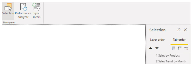
Under ‘View tab’ and ‘Show panes’, click on ‘Selection’ to open the configuration panel, seen in the image below. The two ‘Layer order’ black arrows on the right can be used to play with the order of tabs by moving them up or down, thus creating your most logical sequence. The three ‘Tab order’ icons to the right of the arrows basically provide the options ‘expand all’, ‘collapse all’, and ‘have tab order match visual order’.
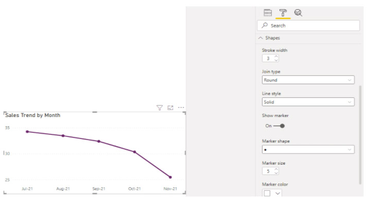
Markers are lines that can be used on a graph or chart to denote a particular value. They might be used to show a trend, or to visually ‘mark’ a significant value. As seen in the image below, Power BI allows for a marker to be added or ‘configured’ by first selecting the visual to which it will be applied, before clicking on the format brush icon at the top of the right-hand column, and then scrolling down to ‘Marker shape’.
Make sure the ‘Show marker’ option is enabled, and you should then see several additional options, such as circle, square, triangle, and more.
As an aside, it’s generally recommended that different shaped markers are used where multiple lines or scatter plots with several variables appear on the visual in question. The use of different markers in such instances can help users with visual or cognitive challenges more easily interpret the data displayed.
Power BI provides an array of default themes. A ‘theme’ in this context is basically a standardised set of visuals, colors, text and shapes, which can be easily applied to a report using just a few clicks, again aiding visual accessibility. The option to create customised themes also exists.
It is strongly recommended that themes are created with the assistance of color contrast tools such as WCAG2.1, or ‘Web Content Accessibility Guidelines’ published by the World Wide Web Consortium's Web Accessibility Initiative. These guidelines offer universally accepted recommendations for making web content more accessible.
The aforementioned accessibility tools are amongst the most used and effective features of Power BI, embraced by users with visual, physical or cognitive disabilities and impairments seeking to consume the same insights and information as every other user who reads or views the report.
Interested in finding out more about how Microsoft Power BI can improve your business processes? Want to discover a plethora of other Business Intelligence (BI) solutions that support the operations of the modern business?
Tridant can help you discover how to improve your business performance through easy and user-friendly access to valuable data and insights, which can support fact-based decisions that will help your business thrive!
Copyright © Tridant Pty Ltd.