
It is important to stay up to date with the updates that a vendor releases with a technology that you have implemented in your organisation so that you can take advantage of the latest features. Very often the vendor will make advances that help integration between various tools that already exist in the technology landscape of your organisation or improve on the way we used to do things in the past.
Here are some important features and enhancements in the latest PowerBI update from August 2021 to October 2021.
Related Reading: Business Intelligence
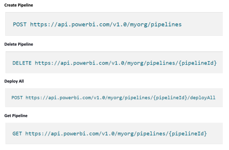
The Deployment pipeline helps in managing PowerBI releases at a fast pace. This recent update enables the general availability of Deployment pipeline APIs.
The new set of APIs contains the following features:
Here are some examples:
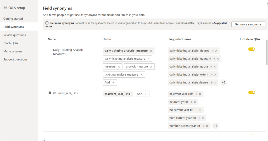
In PowerBI synonyms are an important part of Q&A Visual. Because most often users have a variety of terms to refer to the same field. For example, sum of Sales, Total Sales, Net sales, and Total net sales. The updated feature allows users to share the synonyms with entire organisation and PowerBI helps to recognise these synonyms for the search phrase. This helps in reducing duplication of synonyms by considering other users’ synonyms. These synonyms will be shared once the report is published. The shared synonyms will be shown as a ‘Suggested Term’ while creating synonyms.
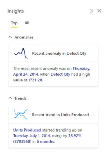
With the availability of Insight feature, users easily find information such as Trends, Anomalies, and KPI analysis. It notifies users when interesting insights are available in the report. Insight’s feature is only available for the reports in Premium and Premium Per User workspaces. No additional setup and configuration are required it automatically generates interesting insights when a user opens the report.
As we are aware of the Bar chart is used to compare between the categories or various types. However, when there are many categories, the coloured bars in the Bar chart fill up a large part of the dashboard surface. To overcome this issue, users can now use Lollipop bar chart from Nova Silva. Instead of Bars, the Lollipop bar chart shows a marker or a dot for each category.
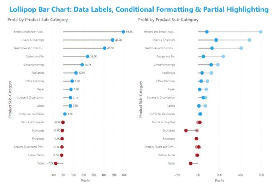
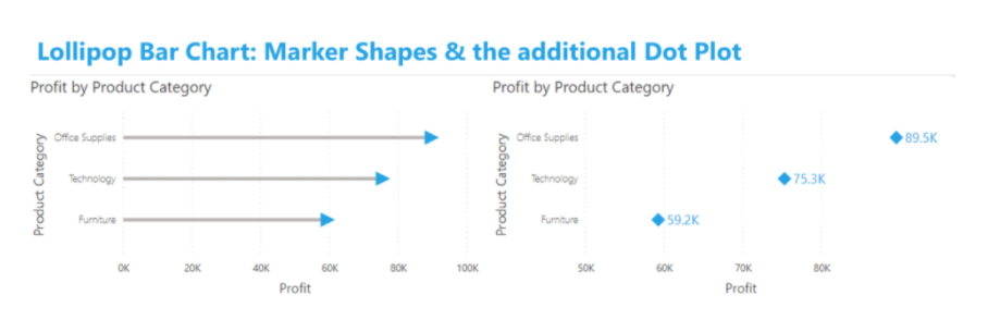
The latest version comes with a couple of enhancements like Conditional Formatting, Data Labels, Partial Highlighting, and Marker shapes.
These are some of the important features in the latest released updates. I believe the Deployment pipeline APIs features and Sharing Synonyms feature could be some of the most useful features in the latest update. Stay tuned for a few more updates yet to be announced for the rest of 2021.
Copyright © Tridant Pty Ltd.